
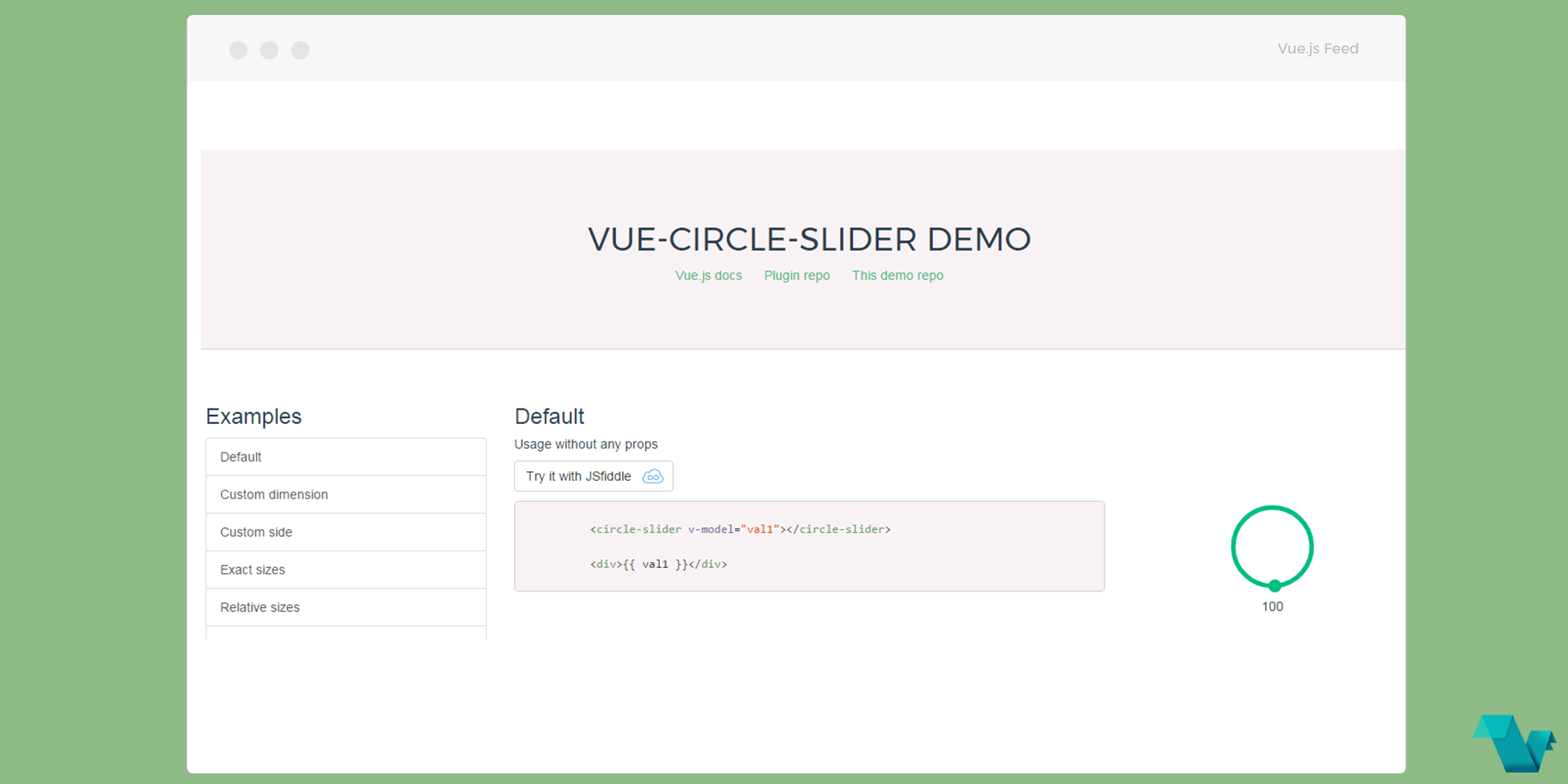
Circle slider component for Vue.js
vue-circle-slider
Another good looking UI component for Vue.js, a circled slider. Offering many options for customization such as colors, sizes & touch devices support, it is a good solution for almost any project.
Functionalities
- svg based view
- binding via v-model
- defining min & max values
- defining step size
- animation while updating to new value on click by circle
- touch devices support (touchmove)
- sizes customization: exact and relative definitions
- colors customization
Working demo of this project available here.
Example
Installation to your Vue project via yarn
yarn add vue-circle-sliderImport it into your app as global component with name CircleSlider
import Vue from 'vue'
import VueCircleSlider from 'vue-circle-slider'

Vue.use(VueCircleSlider)
Usage
Use it directly to your components and customize it using some of the given properties
<circle-slider
    v-model="sliderValue"
    :side="200"
    :min="0"
    :max="1000"
    :step-size="100"
    :circle-width-rel="20"
    :progress-width-rel="10"
    :knob-radius="10"
    knob-color="#00c0ef"
    progress-color="#00f"
></circle-slider>
<div>{{ sliderValue }}</div>
Set the value of the slider to a number and you can display it along with the slider. For details regarding properties check here.

To learn more about this plugin and its interface check its public repository on GitHub.
