
Get sliders using the Vue Awesome Swiper component supporting SPA and SSR
Vue-Awesome-Swiper
The swiper component for Vue.js allows you to add slides in various ways, utilizing Swiper's API.
There is support for Nuxt.js/SSR and it is mobile friendly.
Before creating your own sliders, check some of the 41 available examples to help you use different approaches like 3D cube sliders or Dynamic-Slides.
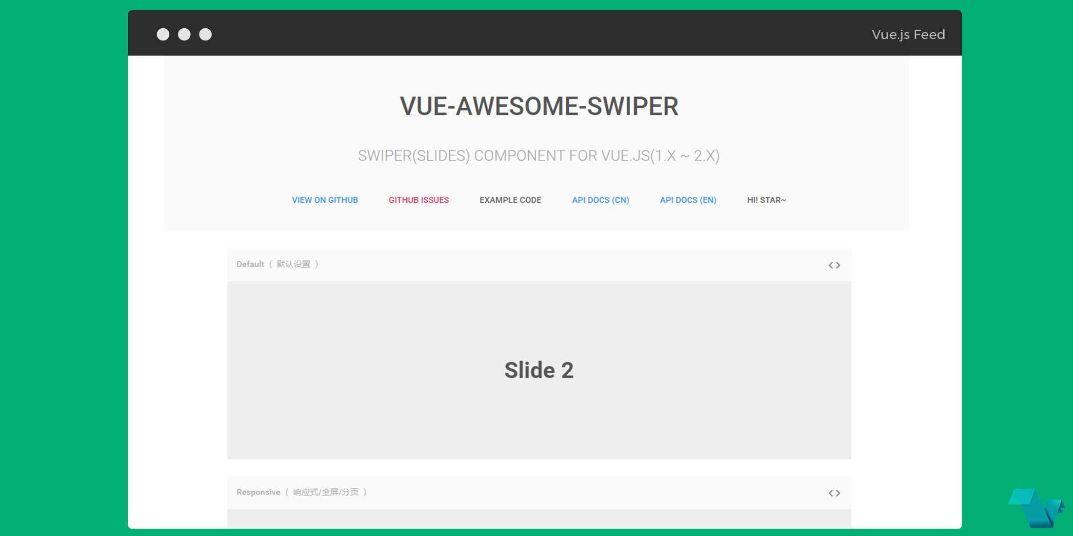
Example
To start working with the Vue Swiper use the following command to install it.
Via yarn:
yarn add vue-awesome-swiperin a Webpack setup
// starting with version 2.6.0, you need to manually introduce swiper's css
require('swiper/dist/css/swiper.css')

// import
import Vue from 'vue'
import VueAwesomeSwiper from 'vue-awesome-swiper'

Vue.use(VueAwesomeSwiper)
Usage:
Use the component anywhere you would like in the template:
<swiper :options="swiperOptionh">
    <swiper-slide><img src="..." ></swiper-slide>
    <swiper-slide>
        <swiper :options="swiperOptionv">
            <swiper-slide><img src="..." ></swiper-slide>
            <swiper-slide><img src="..." ></swiper-slide>

            <div class="swiper-pagination swiper-pagination-v" slot="pagination"></div>
        </swiper>
    </swiper-slide>
    <swiper-slide><img src="..." ></swiper-slide>

    <div class="swiper-pagination swiper-pagination-h" slot="pagination"></div>
</swiper>
pass the options inside the data function
data () {
return {
    swiperOptionv: {
        pagination: '.swiper-pagination-v',
        paginationClickable: true,
        direction: 'vertical',
        spaceBetween: 50
    },
    swiperOptionh: {
        pagination: '.swiper-pagination-h',
        paginationClickable: true,
        spaceBetween: 50
    },
    swiperOption: {
        centeredSlides: true,
        autoplay: 5000,
        loop: true,
        pagination: '.swiper-pagination',
        slidesPerView: 1,
        paginationClickable: true,
        spaceBetween: 30,
        keyboardControl: true,
        nextButton: '.swiper-button-next',
        prevButton: '.swiper-button-prev'
    }
}
}
The above markup is an example of a nested slider which can change slides on both left - right & up - down. Based on the Swiper's API you can use it to change your options.
Here you can see the slider we used above and a simple one:

Differences
SSR and SPA have differences in the use of the :
- in SPAs it is working using the
component, finding swiper instance byref attribute. - in SSR it is working using the
directive, finding swiper instance bydirective arg. - Other configurations, events are the same.
That's it! If you would like to get started with Vue simple floating labels, head to the project's repository on GitHub, where you will also find the source code.
