
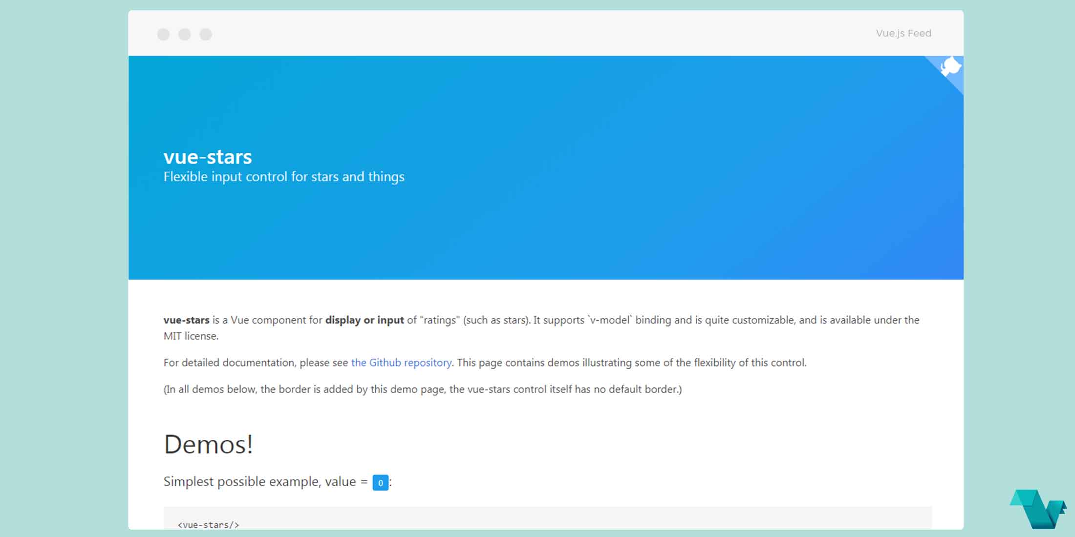
Input control component for ratings: Vue Stars
vue-stars
vue-stars is a simple, highly customizable star rating component for Vue projects. There is a detailed explanation on the page on how things work under the hood:
This control uses radio buttons. The buttons themselves are hidden, the user interacts
with the corresponding <label> tags.
As with any Vue input component, the component's value property won't automatically change to match
the user's selection (though the underlying DOM value will). You'll need to either listen for the input
event and change the property yourself, or use v-model to set up two-way binding.
To work around a known (but obscure) issue with Apple iPhone/iPad, the hover animations are disabled for touchscreen devices.
CSS custom variables are used to implement the custom color properties. I'm hopeful that in the future, Vue will support reactive CSS custom properties natively with handlebar replacements in the style area of the SFCs.
Flexible VueJS input control for ratings (stars, etc.)
Properties
The following properties are supported:
- name
Name of the underlying form fields. This must be unique on your page, otherwise, browsers will apply changes to one rating to others with the same name.
- readonly
Like native input controls, if this is set, the user cannot make changes to the value, but the control will still submit a value if it is part of a form. Hover animations are also disabled.
- value
The integer value of the current rating, from 0 (no set value) to max.
- max
The integer maximum rating (e.g., number of stars or another character the user can choose from).
- char
This is the character to use for each rating.
If you would like to use a different character for each value from 1-max, you can provide a
multi-character string. For example, a letter grade control could use :max="5" char="FDCBA", making
the first rating value an F, the second a D, etc.
If max is longer than the string provided, the last character in char is used for all additional
values. For example, :max="5" char="!★" would result in a rating control like this: !★★★★.
If you're using an icon font such as FontAwesome, providing a literal value could be troublesome since
it won't display in your code editor. Also, Vue does not interpret HTML/XML entity references in
attributes, so using something like char="" won't work. However, you can take advantage of
v-bind's JavaScript interpretation and escape the character in Javascript, e.g., :char="'\uF005'".
While emoji characters are supported, many don't respond to CSS colors, so using a separate character
for inactiveChar (below) is highly recommended. Keep in mind that if you use the JavaScript encoding
for char, many emoji characters are outside the 16-bit range of \uXXXX, so you'll need to use the
surrogate pair form (lead and tail).
Color Properties
Some additional properties are supported on all modern browsers (in other words, not on IE11). These
all accept any normal CSS color expression (triplets, rgb(), etc.).
- activeColor
If specified, this overrides the default gold color used for the active values.
- inactiveColor
If specified, this overrides the default grey color used for the active values.
- hoverColor
If specified, this overrides the default lighter gold color used when hovering over a value.
- shadowColor
If specified, this overrides the default light yellow color used for the active values. (Inactive values don't have a shadow.)
Events
Since this is a custom input control, this component emits a single event, input, when a new value
is selected by the user (the value is returned as the first argument). This event is required for
v-model to work properly (if you choose to use it).
Browser Compatibility
This component is at least compatible with the current versions of Chrome, Firefox, Edge, iOS Safari, and desktop Safari.
IE11 is partially supported. The JavaScript should transpile properly, but it will need a polyfill
for the ES6 method Array.from, and customized colors are not supported (since IE11 lacks CSS
variable support).
Example
Take a look below to see a simple example.
Install vue-stars in your project using:
yarn add vue-starsImport the component where needed:
*.vue
<template>
<div id="app">
        <vue-stars
    :value="4"
    :char="'\uF005'"
    inactive-char="☆"
    active-color="#339933"
    inactive-color="#DDD"
    hover-color="#44aa44"
    shadow-color="#6c6"/>
</div>
</template>

<script>
import VueStars from 'vue-stars'

export default {
  components: {
    VueStars
  },
}
</script>
The above is a simple and very quick approach using a handful of the provided properties.
For more regarding this plugin head on GitHub where it is available under the MIT license.
