
Playing with the Vue Tabs component by Spatie
vue-tabs-component
In today's post we are using a Vue component to easily render tabs, Vue Tabs (Demo here) by Spatie. In this package, you will find what you need to easily display some tabs.
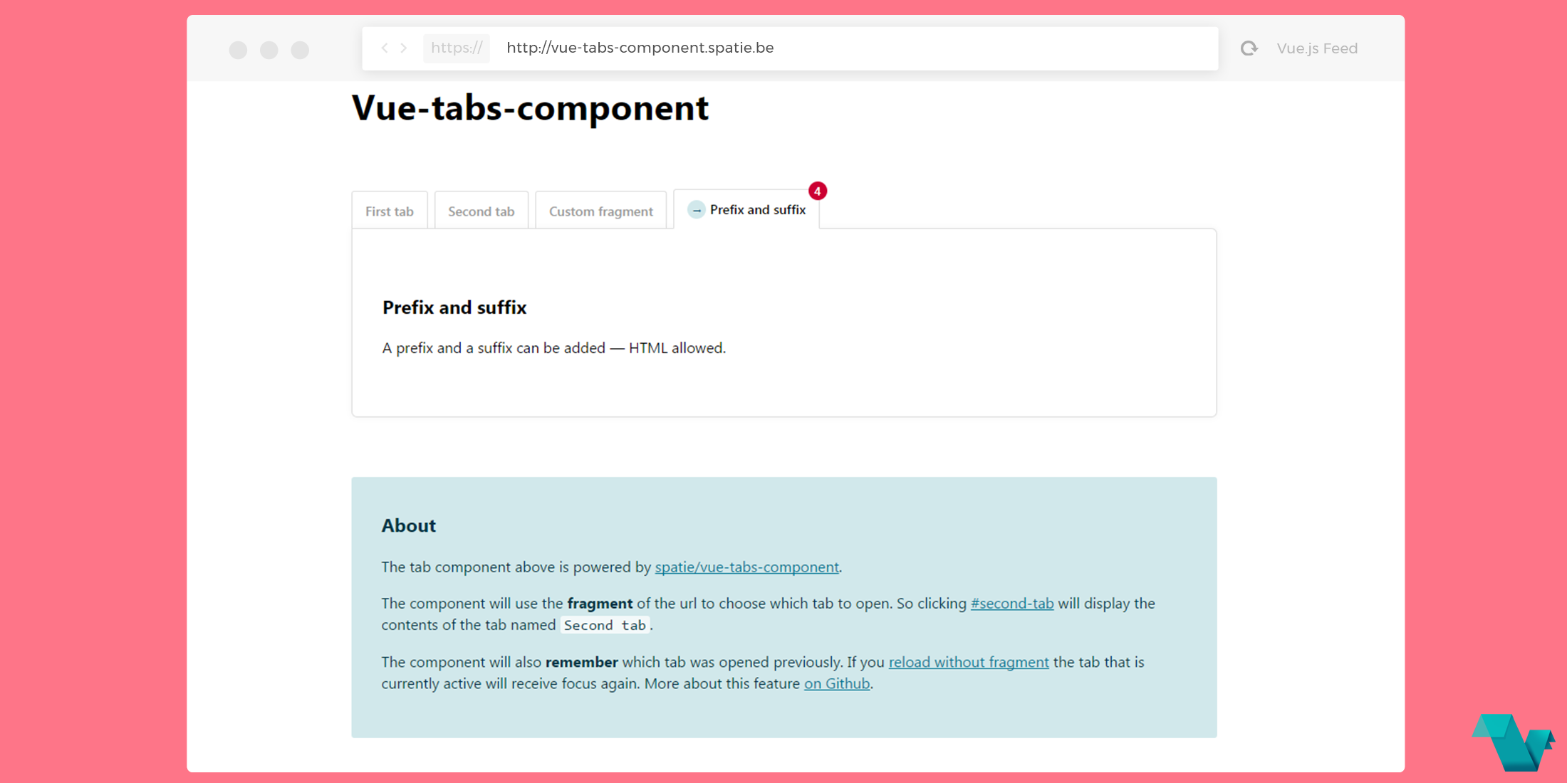
The component will use the fragment of the url to choose which tab to open. So clicking #second-tab will display the contents of the tab named Second tab.
The component will also remember which tab was opened previously. If you reload without fragment the tab that is currently active will receive focus again.
Example
Installation
Install the package via yarn:
yarn add vue-tabs-componentUsage
Import the component globally
import {Tabs, Tab} from 'vue-tabs-component'

Vue.component('tabs', Tabs)
Vue.component('tab', Tab)
Render tabs like so:
<div>
<tabs>
        <tab name="First tab">
            <p>Awesome Tab Components</p>
        </tab>
        <tab name="Second tab">
                <img src="medium.png">
                <h3>using Vue Tabs via Spatie</h3>
        </tab>
        <tab name="Third tab">
                Using custom CSS
        </tab>
</tabs>
To achieve the tabs style via CSS:
.tabs-component {
  margin: 4em 0;
}

.tabs-component-tabs {
  border: solid 1px #ddd;
  border-radius:  6px;
  list-style: none;
  margin-bottom: 5px;
}

@media (min-width: 700px) {
  .tabs-component-tabs {
    border: 0;
    align-items: stretch;
    display: flex;
    justify-content: flex-start;
    margin-bottom: -1px;
  }
}

.tabs-component-tab {
  color: #999;
  font-size: 14px;
  font-weight: 600;
  margin-right: 0;
}

.tabs-component-tab:not(:last-child) {
  border-bottom: dotted 1px #ddd;
}

.tabs-component-tab:hover {
  color: #666;
}

.tabs-component-tab.is-active {
  color: #000;
}

@media (min-width: 700px) {
  .tabs-component-tab {
    background-color: #fff;
    border: solid 1px #ddd;
    border-radius: 3px 3px 0 0;
    margin-right: .5em;
    transform: translateY(2px);
    transition: transform .3s ease;
  }

  .tabs-component-tab.is-active {
    border-bottom: solid 1px #fff;
    z-index: 2;
    transform: translateY(0);
  }
}

.tabs-component-tab-a {
  align-items: center;
  color: inherit;
  display: flex;
  padding: .75em 1em;
  text-decoration: none;
}

.tabs-component-panels {
  padding: 4em 0;
}

@media (min-width: 700px) {
  .tabs-component-panels {
    border-top-left-radius: 0;
    background-color: #fff;
    border: solid 1px #ddd;
    border-radius: 0 6px 6px 6px;
    box-shadow: 0 0 10px rgba(0, 0, 0, .05);
    padding: 4em 2em;
  }
}
Postcardware
You're free to use this package (it's MIT-licensed), but if it makes it to your production environment we highly appreciate you sending us a postcard from your hometown, mentioning which of our package(s) you are using.
See more about this on the GitHub repository.
