
Using Buefy with Vue.js, Lightweight UI components based on Bulma
Buefy UI components for Vue.js
In Vue.js components are the key element in creating pretty much anything. Reusability and clean code are great things in developement and Vue have both. There are a lot of plugins & projects created by community members and others to help Vue developers create their own projects faster and easier and Buefy is one of them. Buefy is a lightweight library of responsive UI components for Vue.js based on Bulma framework and design.

This free library, based on Bulma flexbox CSS framework & vue-admin can help you build your app picking only what you need.
The UI components Buefy offers cover a wide range of needs:
- UI Elements & Layout
- Icon
- Dropdown
- Tooltip
- Dialog
- Toast
- Snackbar
- Notification
- Message
- Input
- Select
- Checkbox
- Radio
- Switch
- Table
- Pagination
Buefy has the entire Bulma's core built in. You can use any feature from Bulma, plus all the components Buefy offers
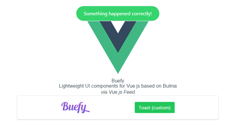
Example
Take a look at the following example, using 2 Buefy components
Install via npm
npm install buefyImport and use Buefy. You can also enable individual components
import Vue from 'vue'
import Buefy from 'buefy'
import 'buefy/lib/buefy.css'

Vue.use(Buefy)

// OR

Vue.component(Buefy.Checkbox.name, Buefy.Checkbox)
Vue.component(Buefy.Table.name, Buefy.Table)
...
Include Material Design Icons
Note: By default Buefy uses Material Design Icons if you want to swap to FontAwesome, go to constructor options.
<link rel="stylesheet" href="//fonts.googleapis.com/icon?family=Material+Icons">Use the components you require:
<template>
<div id="app">
        <div class="box-demo-show">
            <b-dropdown>
                <figure slot="trigger">
                    <img src="./assets/buefy.png" width="94">
                </figure>

                <b-option>Action</b-option>
                <b-option>Another action</b-option>
                <b-option>Something else</b-option>

            </b-dropdown>

            <b-tooltip
            type="is-light"
            label="Tooltip large multilined, ..."
            position="is-bottom"
            multilined
            size="is-large"
            >
            <button class="button is-dark">Multiline (large)
            </button>
        </b-tooltip>
        <button class="button content is-success"
        @click="success"
        >
            Toast (custom)
        </button>
</div>
</div>
</template>

<script type="text/babel">
export default {
  methods: {
    success () {
      this.$toast.open({
        message: 'Something happened correctly!',
        type: 'is-success'
      })
    }
  }
}
</script>
Result of the above
Learn everything you need to start using Buefy by visiting the Documentation or you can give it a star on GitHub.
