
Vue Form Components: Create forms based on the Bootstrap CSS Framework
Vue-Form-Components
When building forms many choose to use Bootstrap forms, taking what you need from it and then adjusting it to fit into your build. This is a common task when building apps and a boring one. In Vue.js for many common needs there are many ready-to-use components and packages, created by the Vue team or the community.
The Vue Form Components package provides form wrappers to use in your project, based on Bootstrap.
Components which are supported are:
- Standard Input Box (Including input addons)
- Toggle Switch
- Text Area
- Select List
Usage Example
To use this package and build forms, you can head to GitHub and download it or install it via npm or yarn
yarn add vue-form-componentsUsing yarn is often time saving.
Then you can you can declare the components as global components like so:
main.js file
import VueFormComponents from 'vue-form-components'

Vue.component('input-box', VueFormComponents.InputBoxComponent)
Vue.component('toggle-switch', VueFormComponents.SwitchComponent)
Two components have been declared, the Standard input box component, designed to save time and repetition by not having to duplicate form groups and Toggle Switch component which displays a nice alternative to a standard checkbox.
*.vue file
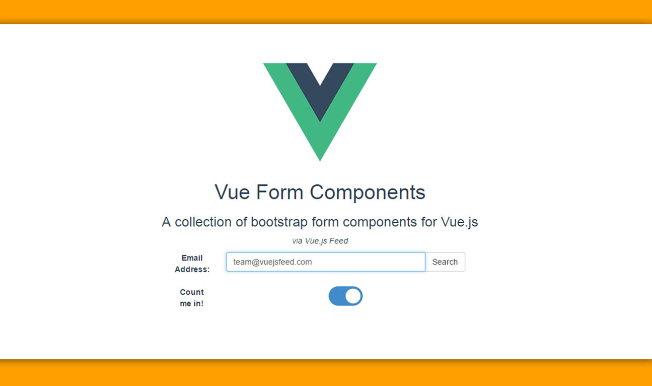
<input-box name="email_address" label="Email Address">
    <button slot="rightBtn" class="btn btn-default">
        Search
    </button>
</input-box>
<toggle-switch name="check" label="Count me in!">
</toggle-switch>
The name prop is required for the input-box component and so for the toggle-switch along with label, so make sure to include those.
This small collection of bootstrap components, can prove handy for building multiple forms quickly. Visit Vue-Form-Components on GitHub for more.
