
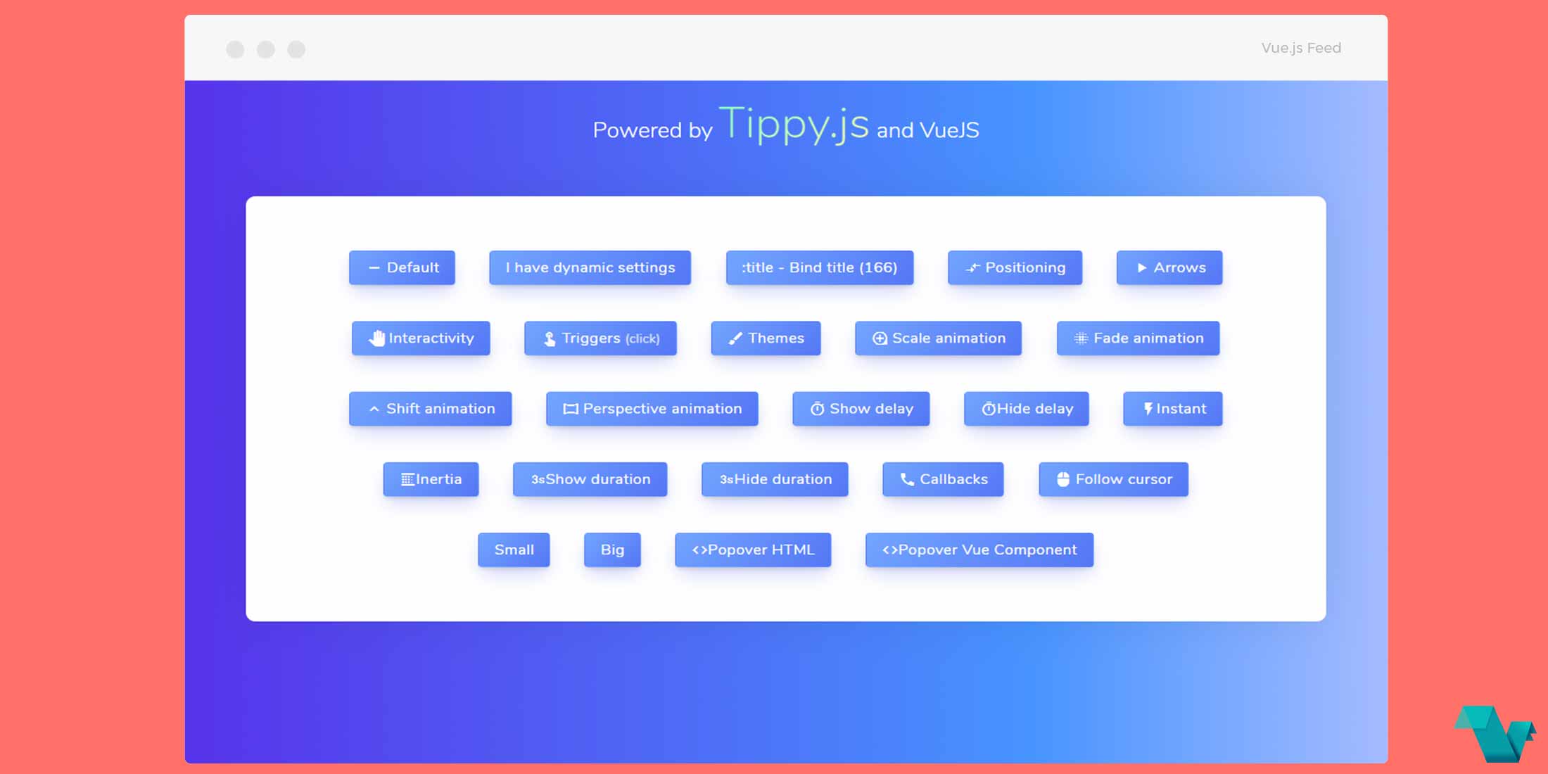
Vue.js Tooltip powered by Tippy.js
vue-tippy
vue-tippy is a Vue.js wrapper for the Tippy.js library, which allows you to use the tooltips as a Vue component and as a directive.

Take a look at the example below.
Example
To start working with vue-tippy use the following command to install it.
npm install vue-tippy --save

OR

yarn add vue-tippy
of load it via CDN
<script src="https://unpkg.com/vue-tippy/dist/vue-tippy.min.js"></script>
If used as a global component
var vueTippy = require('vue-tippy')
Vue.use(vueTippy)
Using the v-tippy directive in multiple elements , when a title attribute is present:
<template>
<!-- Bind title -->
<button :title="dynamicTitle" v-tippy> My Button! </button>
<ul>
    <li
        title="A List!"
        v-tippy="{ position : 'top',  arrow: true, size: 'small' }">
            HEY A LIST
    </li>
</ul>
<button
title="Hello there!"
v-tippy="{ position : 'right',  arrow: false, animation: 'scale', duration: 2000, size: 'big' }"
>
 right!
</button>
<button
title="Great day!"
v-tippy="{ position : 'left',  arrow: false, theme: 'light'}">
left!
</button>
<button
title="Howdy!"
v-tippy="{ position : 'bottom',  arrow: true, animation: 'perspective', size: 'big'}">
bottom!
</button>
</template>
As a Vue component:
<button  v-tippy="{ html : '#comppopup' }"> My Button! </button>
<vue-component-test id="comppopup"></vue-component-test>
You can use options in the confing object, available at the Tippy.js docs. There is also the option for HTML Templates (with or without reactivity).
If you are interested for more or you have any bugs and suggestions, click here. That's it!
