
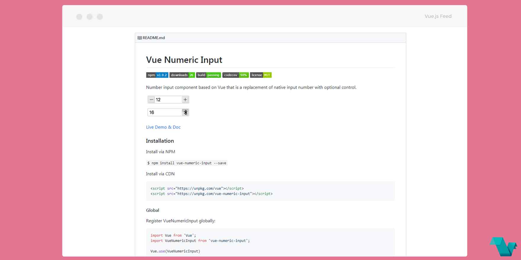
Vue Numeric Input Component: Install and Play
Vue Numeric Input
Number input component inspired by react-numeric-input and powered by Vue which serves as a replacement for the native input number with available options and methods for further customization.
Example
Installation
You can install the component via NPM or CDN
npm install vue-numeric-input --save
For most cases is best to include the Vue Numeric Input component local, directly into your selected file by importing it:
import VueNumericInput from 'vue-numeric-input'

export default {
  components: {
    VueNumericInput
  }
}
Basic usage
Let's fix a numeric input for choosing a day of this month:
<template>
  <div class="date">

    <p>
       <vue-numeric-input
        v-model="value"
        <!-- min & max values -->
        :min="1"
        :max="30"
        size="110px"
        <!-- control type -->
        controls-type="updown"
        autofocus
        >
      </vue-numeric-input>
    </p>

  </div>
</template>

<script>
  export default {
    data() {
      return {
        value: 13,
      };
    },
  };
</script>
You can apply a custom look to the picker by using an id="style" attribute and then use that id to apply CSS inside the <style> section.
Props
Name - Description
- name - Component name
- value - Binding value
- placeholder - Input placeholder
- min - Minimum allowed value
- max - Maximum allowed value
- step - Incremental Step
- align - Alignment of Numeric Value
- size - Component Size
- precision - Number of decimals
- controls - Enable/Disable Controls
- controlsType - Controls Type
- autofocus - Autofocus on Page Load
- readonly - Is Readonly
- disabled - Is Disabled
Events
Event Name | Description | Parameters
- input - triggers when input| (newValue)
- change - triggers when the value changes| (newValue)
- blur - triggers when Input blurs| (event: Event)
- focus - triggers when Input focus| (event: Event)
Methods
Method | Description | Parameters
- focus | focus the Input component
- blur | blur the Input component
This project is open-source under an MIT licence.
