
A collection of components to display loading spinners in Vuejs projects
vue-spinners
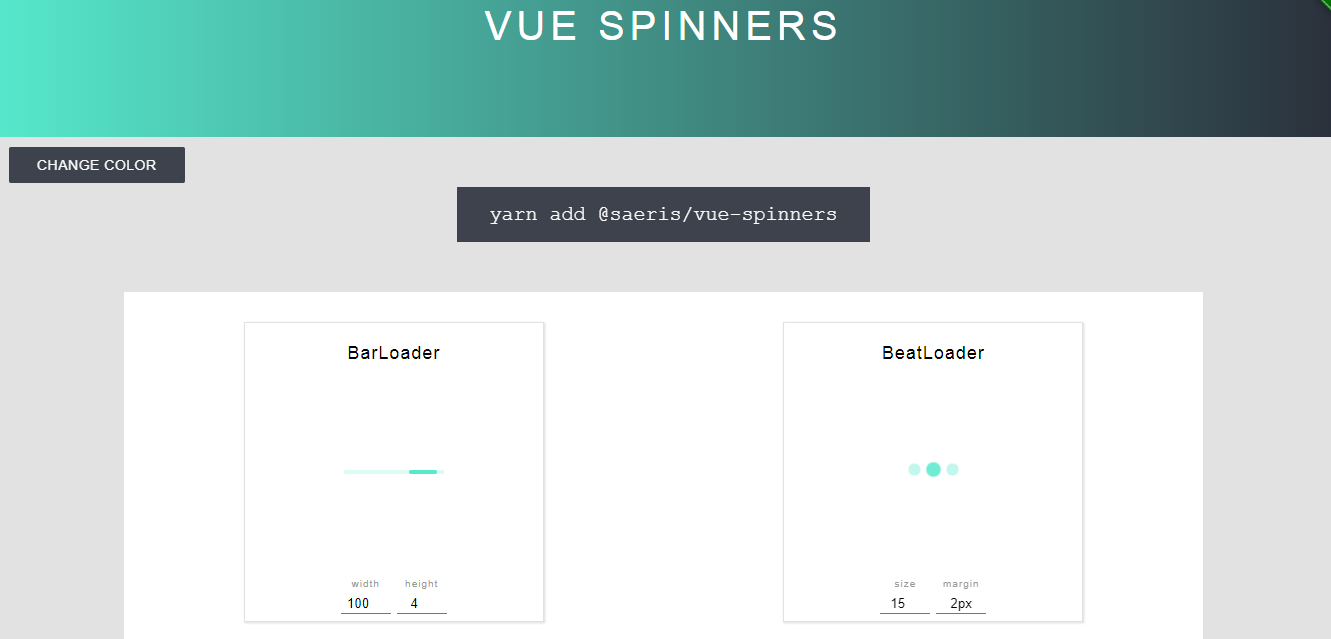
Vue Spinners is a project - a port of react-spinners. Over 20 loading spinners, Vue components, are included to find the one that suits you best.
The Demo page has margin and size settings to see live any changes.
Adding Vue spinners
Installation
yarn add @saeris/vue-spinnersUsage
There are a number of ways you can use this library! Here are a few examples:
import Vue from 'vue'
import { VueSpinners } from '@saeris/vue-spinners'

Vue.use(VueSpinners)

// Each spinner can now be used in your templates anywhere in the app!import { BarLoader } from '@saeris/vue-spinners'
export default {
components: {
BarLoader
},
// ...
}import { BarLoader } from '@saeris/vue-spinners'
export default {
data: () => ({
loading: true
}),
render() {
return (
<div class='loader'>
<ClipLoader
class="custom-class"
loading={this.loading}
color={'#bada55'}
size={150}
sizeUnit={"px"}
/>
</div>
)
}
}<!--Load libraries in your page's header-->
<script src="https://unpkg.com/vue"></script>
<script src="https://unpkg.com/@saeris/vue-spinners"></script>
<!--Use a component somewhere in your app-->
<div id="app">
<bar-loader class="custom-class" :color="#bada55" :loading="loading" :size="150" :sizeUnit="px"></bar-loader>
</div>
<script>
new Vue({ el: '#app', data: { loading: true } })
</script>Available Loaders, PropTypes, and Default Values
Common default props for all loaders:
loading: true
color: '#000000'
For size, height, and width props, there are sizeUnit, heightUnit, and widthUnit prop that accepts px, %, or em. The default for the unit prop is px. Depending on the chosen spinner different settings can be used adjust it.
The collection is open-source and available on GitHub. A project by @Saeris.
