
Create progress bars and circles with Vue Multiple Progress
vue-multiple-progress
The Progress bar component can be used to show the progress of an operation, informing the user of the current status and what to expect.

Check the Demo page
Options
- Progress in lines/circles
- Set percentage/colors
- Icons depending on the status or text/percentage
and more below.
Example
To start working with vue-multiple-progress use the following command to install it.
$ yarn add vue-multiple-progressImport in your project
import Vue from 'vue'
import Progress from 'vue-multiple-progress'
Vue.component('VmProgress', Progress)
Component Usage:
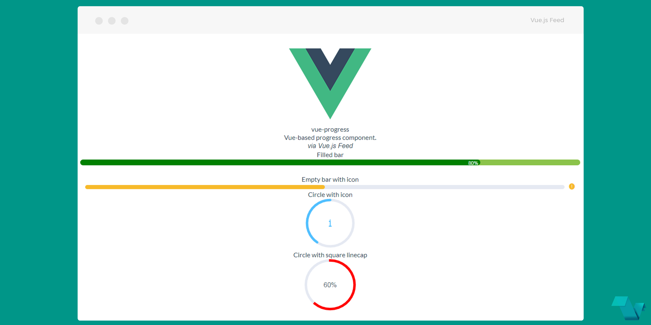
<h3>Filled bar</h3>
<VmProgress
<!-- set options according to documentation -->
percentage="80"
stroke-width="14"
stroke-color="green"
track-color="#8BC34A"
text-inside="true"
    >
</VmProgress>
<h3>Empty bar with icon</h3>
<VmProgress
percentage="50"
stroke-width="10"
status="warning"
>
</VmProgress>
<h3>Circle with icon</h3>
<VmProgress
 percentage="40"
 type="circle"
 width="120"
 status="info"
 reverse="true"
>
</VmProgress>
<h3>Circle with square linecap</h3>
<VmProgress
 percentage="60"
 type="circle"
 stroke-color="red"
 stroke-linecap="square"
 >
 </VmProgress>
In this example, a combination of available options is being made to create 4 different progress- components, 2 linear progress bars & 2 circles with icons or percentages.
That's it! If you would like to explore more about vue-multiple-progress, head to the project's repository on GitHub, where you will also find the source code.
