
Pretty button animations with VueStar
VueStar
VueStar is a plugin that essentially is a like button with delightful star animations powered by Vue.js.
To see the animations, please scan the following two-dimensional code or follow this link: http://web-oysun.cn/VueStar/

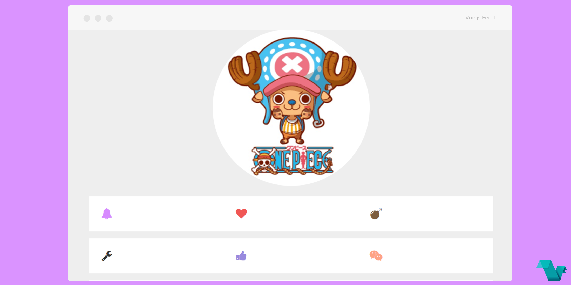
Take a look at the example below.
Example
To start working with the VueStar use the following command to install it.
$ yarn add vue-starIf used as a global component
import Vue from 'vue'
import VueStar from 'vue-star'
Vue.component('VueStar', VueStar)
If used as a local component
//In a component
import VueStar from 'vue-star'
export default {
  components: {
    VueStar
  }
}
The code below is making use of the animate.css library and Font Awesome icons.
<div class="icons">
<vue-star animate="animated bounce" color="#F05654">
    <i slot="icon" class="fa fa-genderless"></i>
</vue-star>
<vue-star animate="animated flash" color="#41f4c7">
    <i slot="icon" class="fa fa-user-circle-o"></i>
</vue-star>
<vue-star animate="animated shake" color="#4248f4">
    <i slot="icon" class="fa fa-bluetooth-b"></i>
</vue-star>
<vue-star animate="animated tada" color="#f47d41">
    <i slot="icon" class="fa fa-binoculars"></i>
</vue-star>
</div>
The animate prop is used to specify the like button animation, the default is no animations at all, and you can add animation CSS classes of course.
The color is used to set a color to the button when it is active. Note: The value of this parameter must be filled in hex or RGB color code, rather than the css class.
To the slot fill in any content you want, it is the carrier of the like button, events should be bound in the slot.

If you are interested for more or you have any bugs and suggestions, click here. That's it!
