
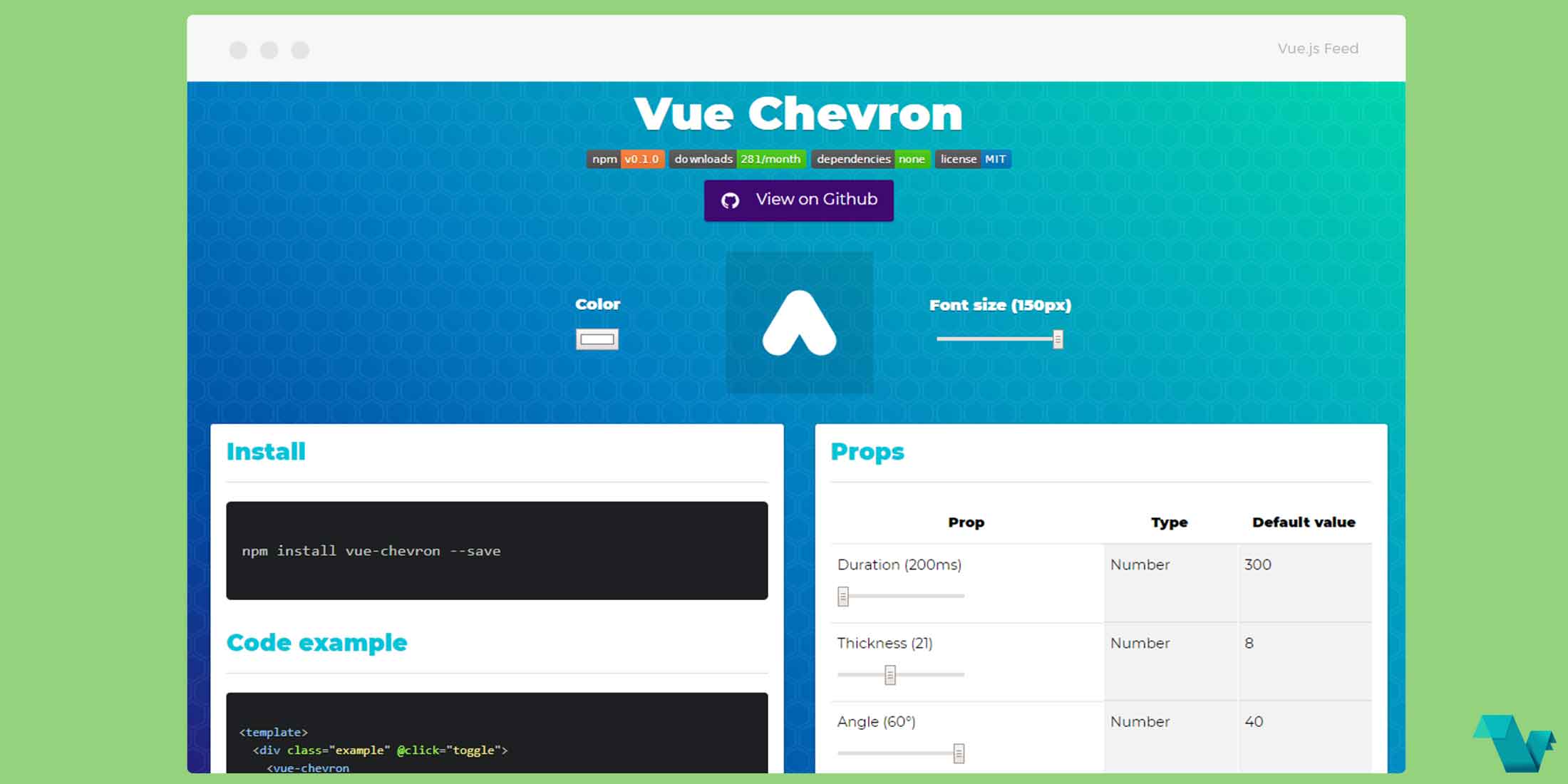
Use an animated chevron icon component for Vue.js
vue-chevron
vue-chevron can be used as an animated chevron icon in Vue.js projects.
To see how to implement Vue Chevron, follow the simple example below.
Example
To start working with the component use the following command to install it:
npm install vue-chevron --saveor
yarn add vue-chevronThere are props and events below you can use to make it fit to your needs.
Props
props: {
  // animation duration
  duration: {
    default: 300
  },

  thickness: {
    default: 8
  },

  angle: {
    default: 40
  },

  round-edges: {
    default: true
  }
}
Usage
Using some of the options above we can create the following example:
<template>
  <div class= 'chevron'>
<vue-chevron
    :point-down="pointDown"
    :duration="duration"
    :thickness="thickness"
    :angle="angle"
    :round-edges="roundEdges"
  />
  </div>
</template>

<script>
import VueChevron from 'vue-chevron'

  export default {
    components: { VueChevron },
  data() {
    return {
      pointDown: true,
      thickness: 12,
      duration: 400,
      angle: 60,
      roundEdges: false
    }
  },
  methods: {
    toggle() {
      this.pointDown = !this.pointDown;
    }
  }
  }
</script>
Using a simple class, here chevron you can use your preffered color and size:
<style>
.chevron {
  color: #b50c0c;
  font-size: 80px;
}
</style>
And there it is, a toggleable element content easy and fast.
Note there is also an option for Easings but are not included to keep the library size minimum. Pass in your own easing functions to get the desired effect.
This project is open source available on GitHub made by @irkopal
