
Using a Mobile friendly Vue.js Modal
Vue.js 2.0+ modal
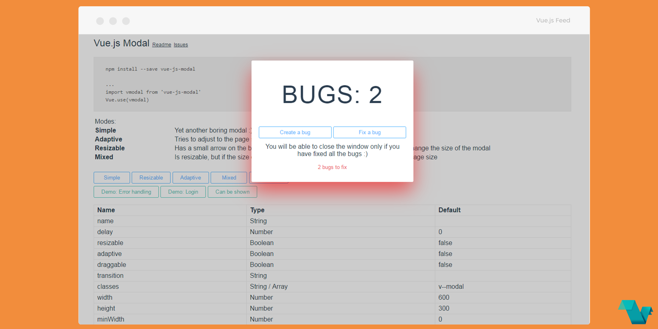
Another great component for Vue.js projects is here, the Vue.js 2.0+ modal which is highly customizable, mobile friendly, and offers features like dragging and resizing. You can take a look at the available modes at the Demo page.
The modal can be simple, draggable, can resize, use a condition in order the user to be able to close it, or all these mixed together. Below you will find an example using some of these properties.
Modes:
- Simple Yet another boring modal
- Adaptive Tries to adjust to the page size
- Resizable Has a small arrow on the bottom-right corner (customizable) that you can drag to change the size of the modal
- Mixed Is resizable, but if the size of the screen is changed - modal will try to adapt to the page size
For a list for the available props and events click here.
Example
Install via yarn
yarn add vue-js-modalImport it into your project
import vmodal from 'vue-js-modal'
Vue.use(vmodal)
Use it in your templates
<modal name="example-modal"
    :resizable="resizable"
    :adaptive="adaptive"
    :draggable="draggable"
    >
<h1>Vuejs Lorem</h1>
<p>Lorem ipsum...</p>
</modal>
<button @click="show">
    Resizable & Draggable
</button>

export default {
  name: 'app',
  data () {
    return {
      resizable: true,
      adaptive: true,
      draggable: true
    }
  },
  methods: {
    show () {
      this.$modal.show('example-modal')
    },
    hide () {
      this.$modal.hide('example-modal')
    }
  }
}
</script>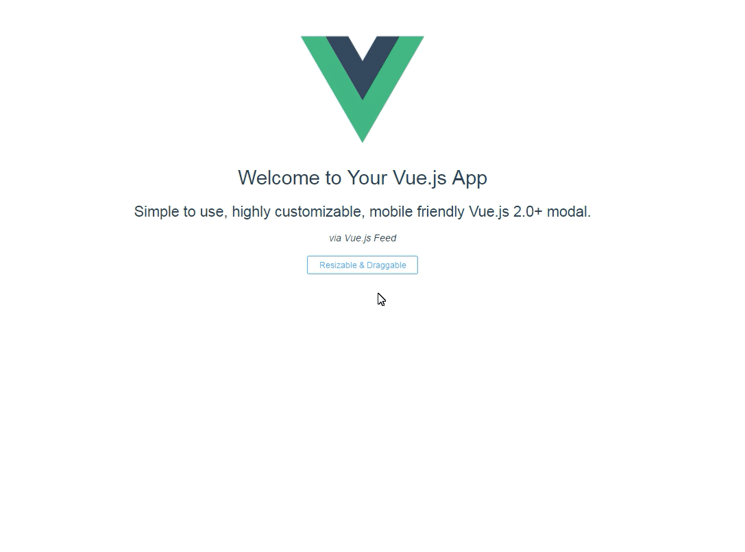
This plugin is available on GitHub, where you will find everything you need to know.
