
Using the VueLinkPopover component plugin for Vue.js
VueLinkPopover
The VueLinkPopover component is an easy to use plugin for your Vue projects, to create popovers while hovering above elements or on clicking them.
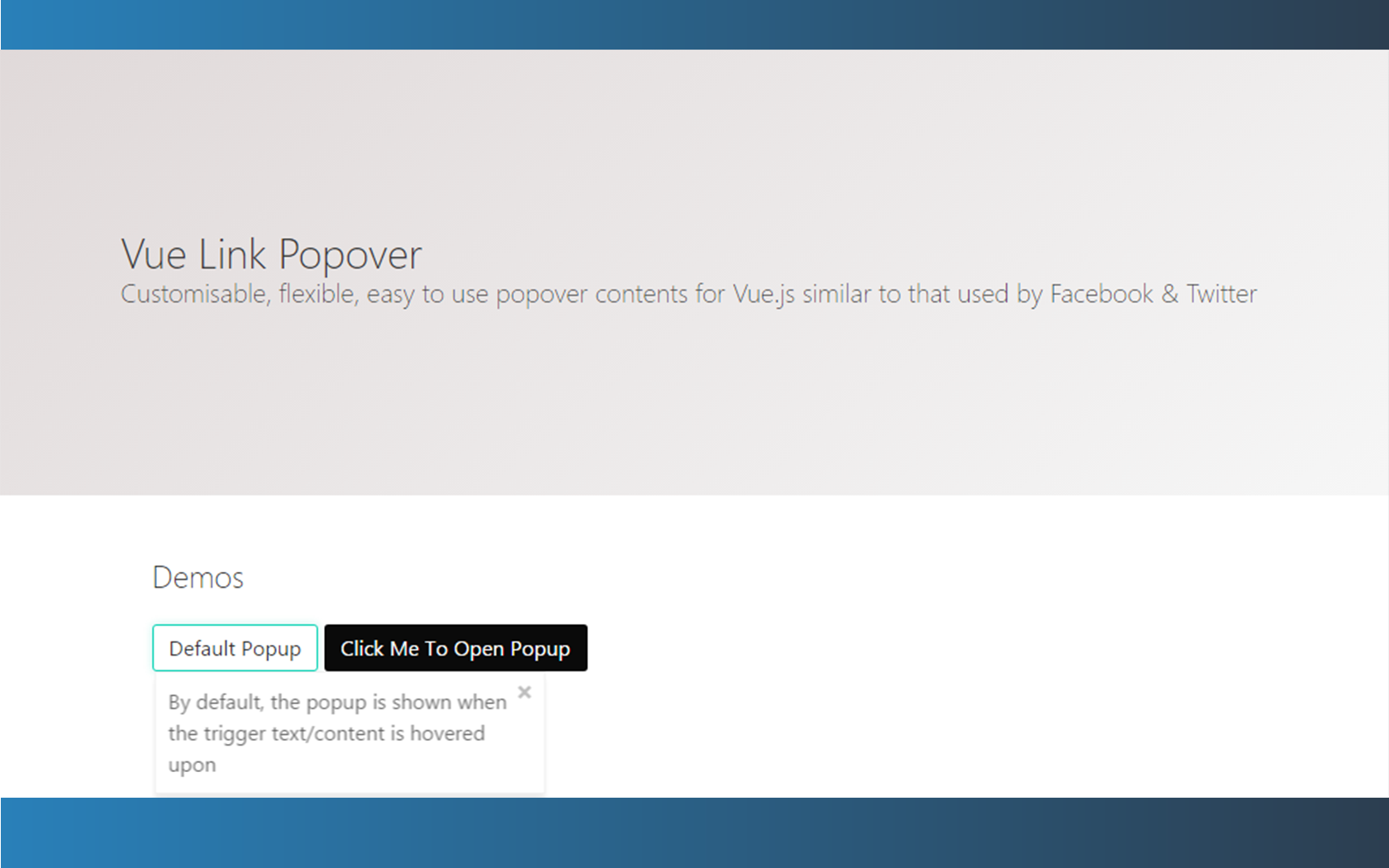
Customisable, flexible, easy to use popover contents for Vue.js similar to that used by Facebook & Twitter.
You can visit the Demo page to see what is all about, along with some instructions.
Example
Follow this simple example to see how it works.
Installation
In a Vue.js project, install with
npm install --save vue-link-popoverFor browser based environments, you can download popover.js or use it from a CDN: <script src="https://unpkg.com/vue-link-popover@2.0.0/popover.js"><script>
Optionally but recommended, include the default stylings by either copying & tweaking the styles in themes/default.css or by including it via CDN
<link rel="stylesheet" href="https://unpkg.com/vue-link-popover@2.0.0/themes/default.css" />
Usage
Import it globally & register
This also allows the passing of customization options such as transitionName & custom themes.
import LinkPopover from 'vue-link-popover'

Vue.use(LinkPopover)
Then you can use it in your *.vue files
<link-popover>
<button class="btn btn-lg btn-primary">
    Try hovering
</button>
 <div slot="content">
     Hovering over the popover.
 </div>
</link-popover>
By default, the popover shows when hovered upon, but you can change that to <link-popover click="true"> so it the popover will open only on click.
Result:

The VueLinkPopover is available on a GitHub repo where you can find everything you need to get started.
