
Using transition components without external libraries
vue2-transitions
The transitions components Vue 2 Transitions for Vue.js allows you to create transitions in various ways, utilizing this configurable collection. Each transition component has ~2kb (non-minified js+css or ~400 bytes gzipped) and you can import only the ones you really need.
Many alternative solutions import the whole animate.css library. Vue2-transitions is minimalistic and lets you import only the transitions that you need in your app.
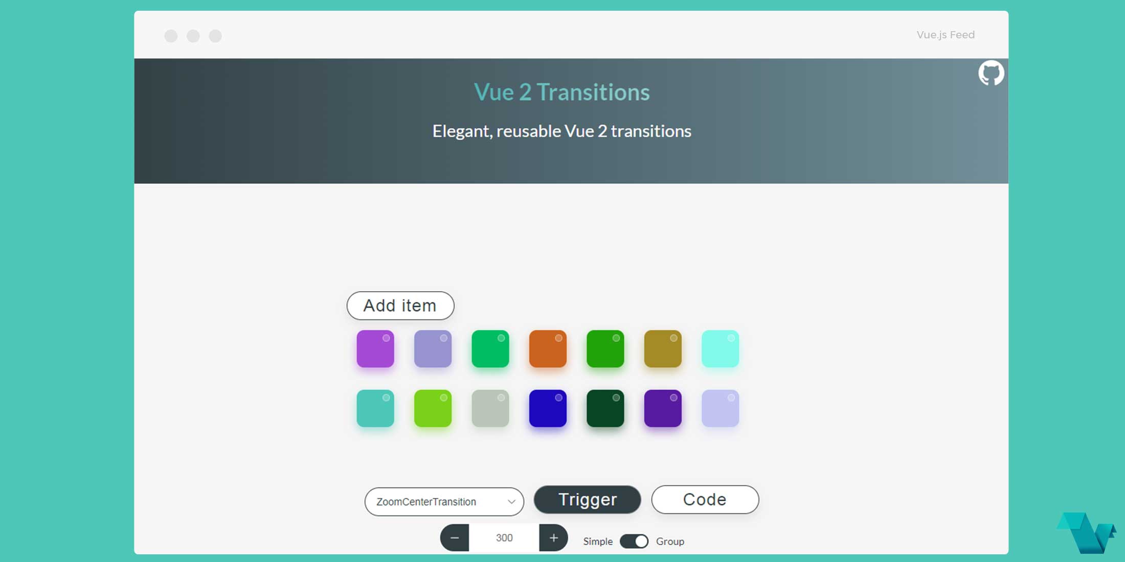
List of available transitions
- FadeTransition
- ZoomCenterTransition
- ZoomXTransition
- ZoomYTransition
- ZoomUpTransition
- CollapseTransition
- ScaleTransition
- SlideXLeftTransition
- SlideXRightTransition
- SlideXUpTransition
- SlideXDownTransition
Props
props: {
  /**
   * Transition duration. Number for specifying the same duration for enter/leave transitions
   * Object style {enter: 300, leave: 300} for specifying explicit durations for enter/leave
   */
  duration: {
    type: [Number, Object],
    default: 300
  },
  /**
   * Whether the component should be a `transition-group` component.
   */
  group: Boolean,
  /**
   *  Transform origin property https://tympanus.net/codrops/css_reference/transform-origin/.
   *  Can be specified with styles as well but it's shorter with this prop
   */
  origin: {
    type: String,
    default: ''
  },
  /**
   * Element styles that are applied during transition. These styles are applied on @beforeEnter and @beforeLeave hooks
   */
  styles: {
    type: Object,
    default: () => {
      return {
        animationFillMode: 'both',
        animationTimingFunction: 'ease-out'
      }
    }
  }
}
Group transitions
Each transition can be used as a transition-group by adding the group prop to one of the desired transitions.
<fade-transition group>
   <!--keyed children here-->
</fade-transition>
Gotchas/things to watch:
- Elements inside
grouptransitions should havedisplay: inline-blockor must be placed in a flex context: Vue.js docs reference -
Each transition has a
moveclass move class docs. Unfortunately, the duration of the move transition cannot be configured through props. By default each transition has amoveclass associated with.3stransition duration:- Zoom
.zoom-move{ transition: transform .3s ease-out; } - Slide
.slide-move{ transition: transform .3s ease-out; } - Scale
.scale-move{ transition: transform .3s cubic-bezier(.25,.8,.50,1); } - Fade
.fade-move{
transition: transform .3s ease-out;
}
If you want to configure the duration, just redefine the class for the transition you use with the desired duration.
- Zoom
Example
To start working with the Vue Swiper use the following command(s) to install it.
npm i vue2-transitions
yarn add vue2-transitions
in a Webpack setup
import Vue from 'vue'
import Transitions from 'vue2-transitions'
Vue.use(Transitions)
Usage:
Use the component anywhere you would like in the template:
<template>
<scale-transition>
<div class="box" v-show="show">
<p>Your transition</p>
</div>
</scale-transition>
</template>

<script>

export default {
name: 'app',
data(){
return {
    show: true
}
},
methods: {
toogle(){
    this.show = !this.show
}
}
}
</script>
The above markup is an example of a ScaleTransition.
That's it! If you would like to get started with Vue Transitions, head to the project's repository on GitHub, where you will also find the source code.
