
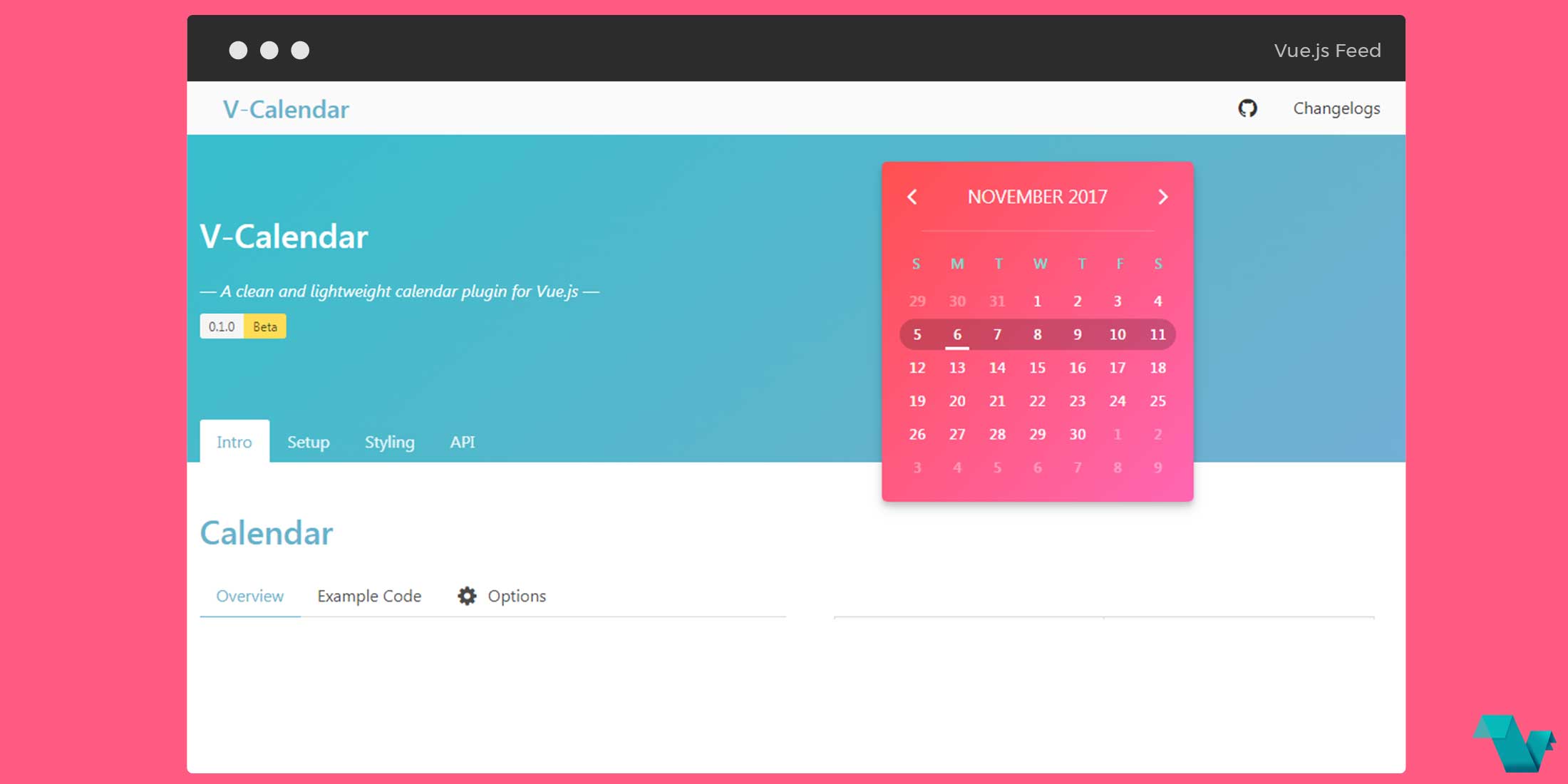
V-Calendar: A clean and lightweight calendar plugin for Vue.js
v-calendar
V-Calendar is a clean and lightweight Vue.js plugin for displaying simple, annotated calendars. It was designed from the outset with extendability and customization in mind. However, it also has some neat built-in ways to communicate information to your users through the use of attributes.
Features
- Display clean and simple attributed calendars
- Built-in support for various attributes, including
- highlighted regions
- indicators
- day content styles (hovered and non-hovered)
- Apply attributes over multiple dates or date ranges (start & end dates)
- Date-picker supporting all native v-calendar props/events with various selection modes
- single date
- multiple dates
- date range
- Extensive API with custom slot support
- Responsive and mobile-friendly
- Handles taps for date selection
- Handles swipes for month navigation
This plug-in is currently in beta state.
Of course, V-Calendar is responsive and mobile friendly. It even responds to taps for day selection and touch swipes for navigation.
Take a look at the example below.
Example
Vue.js version 2.4+ is required.
1 Install via npm
npm install v-calendar2 Import and use VCalendar
import Vue from 'vue'
import VCalendar from 'v-calendar'
import 'v-calendar/lib/v-calendar.min.css'

Vue.use(VCalendar);
3 Reference in your component templates
<template>
  <div id="app">
  <v-date-picker
     mode='single'
    tint-color='#f142f4'
    v-model='selectedDate'
    :theme-styles='themeStyles'
    is-double-paned
    is-inline>
  </v-date-picker>
  </div>
</template>

<script>
export default {
  name: 'app',
  data () {
    return {
      selectedDate: null,
      themeStyles: {
        wrapper: {
          border: '1',
        },
        header: {
          color: '#fafafa',
          backgroundColor: '#f142f4',
          borderColor: '#404c59',
          borderWidth: '1px 1px 0 1px',
        },
        headerVerticalDivider: {
          borderLeft: '1px solid #404c59',
        },
        weekdays: {
          color: '#ffffff',
          backgroundColor: '#f142f4',
          borderColor: '#ff0098',
          borderWidth: '0 1px',
          padding: '5px 0 10px 0',
        },
        weekdaysVerticalDivider: {
          borderLeft: '1px solid #404c59',
        },
        weeks: {
          border: '1px solid #dadada',
        },
      },
    };
  }
}
</script>
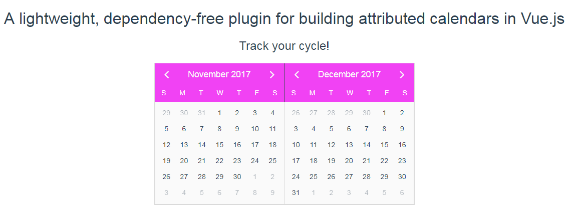
Using the above code we can add a date-picker which displays 2 months and styles of our choosing:
There are a lot of options regarding, props, events, slots, attributes and more, listed on the API page.
A Vue.js plugin for building attributed calendars in Vue.js, that's it! If you are interested for more info or you have any bugs and suggestions, click here.
