
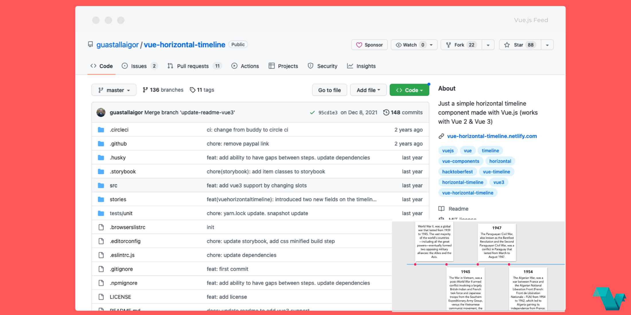
Vue-horizontal-timeline: Horizontal timeline component for Vue.js
Vue-horizontal-timeline is a simple horizontal timeline component made with Vue.js (works with Vue 2 & Vue 3).
Demo
Interact with a working Demo on https://codesandbox.io/s/o4o10xynoz
Storybook
Go to https://vue-horizontal-timeline.netlify.com
How to install
npm
$ npm install vue-horizontal-timeline --saveyarn (recommended)
$ yarn add vue-horizontal-timelineQuick start
Vue.js
You can import in your main.js file
import Vue from "vue";
import VueHorizontalTimeline from "vue-horizontal-timeline";

Vue.use(VueHorizontalTimeline);`

Or locally in any component

`import { VueHorizontalTimeline } from "vue-horizontal-timeline";
// In v0.8+ you don't need the brackets above

export default {
  components: {
    VueHorizontalTimeline,
  },
};
Nuxt.js
You can import as a Nuxt.js plugin
~/plugins/vue-horizontal-timeline.js`

`import Vue from "vue";
import VueHorizontalTimeline from "vue-horizontal-timeline";

Vue.use(VueHorizontalTimeline);

and then import it in your `nuxt.config.js` file

plugins: ["~/plugins/vue-horizontal-timeline.js"];
Basic usage
<template>
  <vue-horizontal-timeline :items="items" />
</template>

<script>
  export default {
    data() {
      const example1 = {
        title: "Title example 1",
        content:
          "Lorem ipsum dolor sit amet, consectetur adipiscing elit. Ut ex dolor, malesuada luctus scelerisque ac, auctor vitae risus. Vivamus risus dolor, faucibus a bibendum quis, facilisis eget odio.",
      };
      const example2 = {
        title: "Title example 2",
        content:
          "Lorem ipsum dolor sit amet, consectetur adipiscing elit. Ut ex dolor, malesuada luctus scelerisque ac, auctor vitae risus. Vivamus risus dolor, faucibus a bibendum quis, facilisis eget odio.",
      };
      const example3 = {
        title: "Title example 3",
        content:
          "Lorem ipsum dolor sit amet, consectetur adipiscing elit. Ut ex dolor, malesuada luctus scelerisque ac, auctor vitae risus. Vivamus risus dolor, faucibus a bibendum quis, facilisis eget odio.",
      };
      const items = [example1, example2, example3];

      return { items };
    },
  };
</script>
Props
items
Type: Array
Default: null
Description: Array of objects to be displayed. Must have at least a content property
item-selected
Type: Object
Default: {}
Description: Object that is set when it is clicked. Note that clickable prop must be set to true
item-unique-key
Type: String
Default: ‘’
Description: Key to set a blue border to the card when it is clicked (clickable
prop must be set to true)
title-attr
Type: String
Default: ‘title’
Description: Name of the property inside the objects, that are in the items array, to set the cards title
title-centered
Type: Boolean
Default: false
Description: Centralizes the cards title
title-class
Type: String
Default: ‘’
Description: If you want to set a custom class to the cards title, set it here
title-substr
Type: String
Default: 18
Description: Number of characters to display inside the cards title. Above this, will set a '...' mask
content-attr
Type: String
Default: ‘content’
Description: Name of the property inside the objects, that are in the items array, to set the cards content
content-centered
Type: Boolean
Default: false
Description: Centralizes all the cards content text
content-class
Type: String
Default: ‘’
Description: If you want to set a custom class to the cards content, set it here
content-substr
Type: String
Default: 250
Description: Number of characters to display inside the cards content. Above this, will set a '...' mask
min-width
Type: String
Default: ‘200px’
Description: Min-width of the timeline
min-height
Type: String
Default: ‘’
Description: Min-height of the timeline
timeline-padding
Type: String
Default: ‘’
Description: Padding of the timeline
timeline-background
Type: String
Default: '#E9E9E9’
Description: Background color of the whole timeline
line-color
Type: String
Default: '#03A9F4’
Description: Color of the line inside the timeline
clickable
Type: Boolean
Default: true
Description: Makes the card clickable that returns the object
You can also change the step color and the style of each item using the stepCssClass and boxCssClass attributes inside each item:
const example1 = {
  title: "Title example 1",
  content:
    "Lorem ipsum dolor sit amet, consectetur adipiscing elit. Ut ex dolor, malesuada luctus scelerisque ac, auctor vitae risus. Vivamus risus dolor, faucibus a bibendum quis, facilisis eget odio.",
  stepCssClass: 'has-step-green',
  boxCssClass: 'has-color-red'
};
<style>
.has-color-red {
color: red !important;
}
.has-step-green::after {
background: green !important;
}
</style>Development
Note: Contributions are very welcomed, however is very important to open a new issue using the issue template before you start working on anything, so we can discuss it before hand
Fork the project and enter this commands in your terminal
$ git clone https://github.com/YOUR_GITHUB_USERNAME/vue-horizontal-timeline.git
$ cd vue-horizontal-timeline
$ yarn
Storybook
For visual testing, this project contains storybook which you can run by doing the next command
$ yarn storybookJest
Before making the PR, if you changed something that needs to be tested, please make the tests inside the tests/unit folder.
To run the tests, you can use the next command
$ yarn test:unitCSS
All the CSS is at src/assets/css/style.scss
If you make any changes in that file, you will need to run yarn build to build it, because the component uses the minified version at src/assets/css/style.min.css
Commitlint
This project follows the commitlint guidelines, with minor changes.
You can commit using npm run commit to help you with that.
There's a pre-push hook that runs all the unit tests before you can push it.
If an error occurs, you can use the npm run commit:retry command that runs the previous npm run commit that you already filled.
