
Vue.js Component: Vue 2 Simple Alert, Inspired by SweetAlert
vue2-simplert
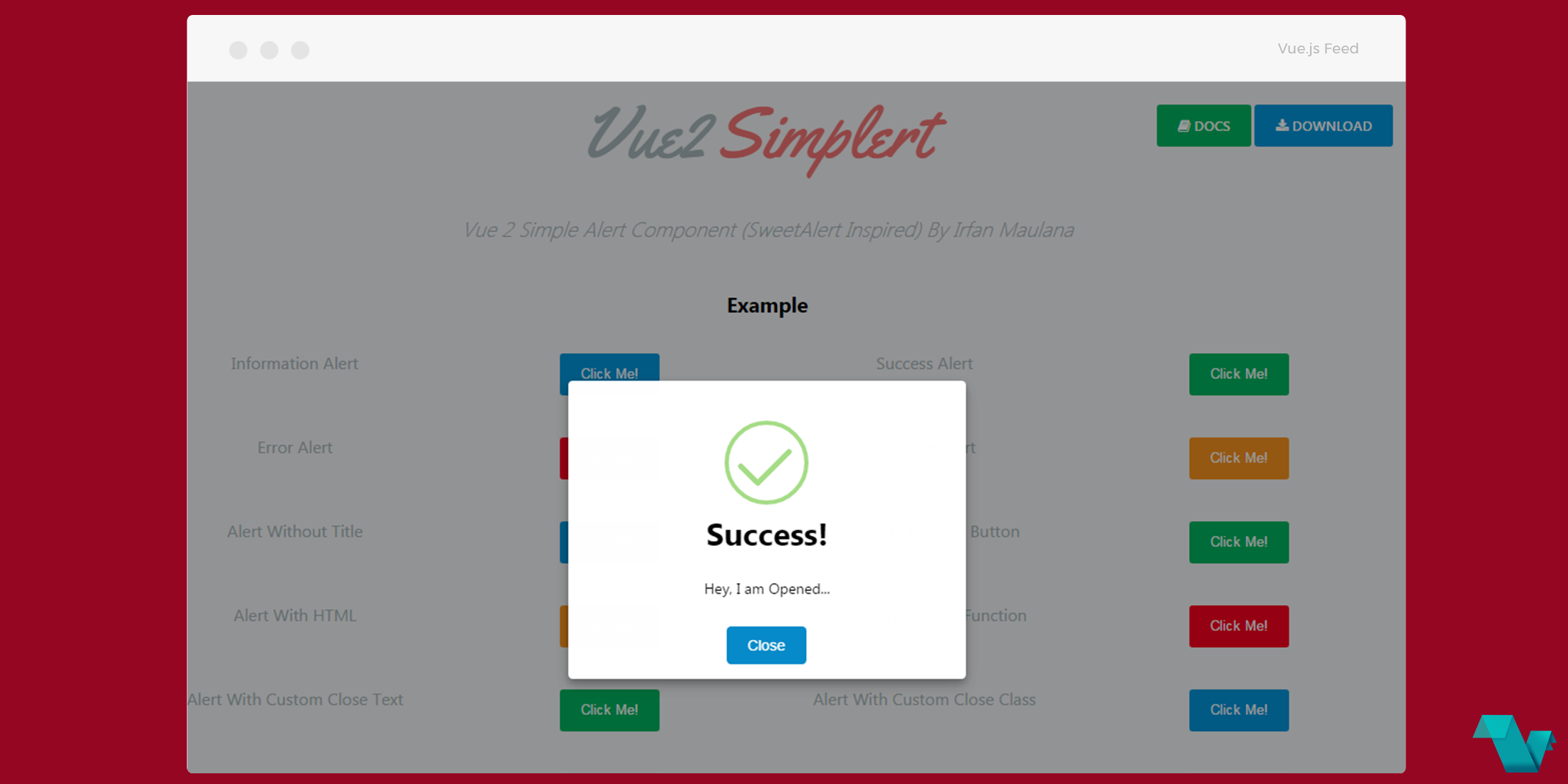
A component to display easy and good looking modals, very similar & inspired by Sweetalert, is the Vue 2 Simple Alert Component.
Example
Install it via yarn to your Vue.js project
yarn add vue2-simplertImport Simplert from node_modules
import Simplert from 'vue2-simplert'

<script>
export default {
   components: {Simplert}
};
</script>
and bring the component inside your templates
<simplert
    isUseRadius=true
    isUseIcon=true
    ref="simplert">
</simplert>
To open the Simplert use a method and pass an Object Parameter
methods: {
    openSimplert () {
        this.$refs.simplert.openSimplert(this.obj)
    },
}
The object can exist within your data function
obj: {
    title: 'Opened Simplert', //  string -- title alert
    message: 'Now <b>close</b> it', // string -- message alert
    type: 'info', // string -- type : info (default), success, warning, error
    colorBtn: '#00b35e', // string -- hex color code (default: #068AC9)
    onClose: this.onClose, // function -- when close triggered
    customCloseBtnText: 'Close Simplert', //  string -- close button text
    customCloseBtnClass: 'btn btn-warning' //  string -- custom class fro button close
    // customClass: '', // string -- custom class in simplert div
    // customIconUrl: '' //  string -- custom url custom image icon
}
And open the Simplert

In it you can have custom icons, HTML, custom class for button & texts and more, which you can find on the wiki page of the documentation, Methods And Props.
Vue 2 Simple Alert Component (SweetAlert Inspired) By Irfan Maulana
