
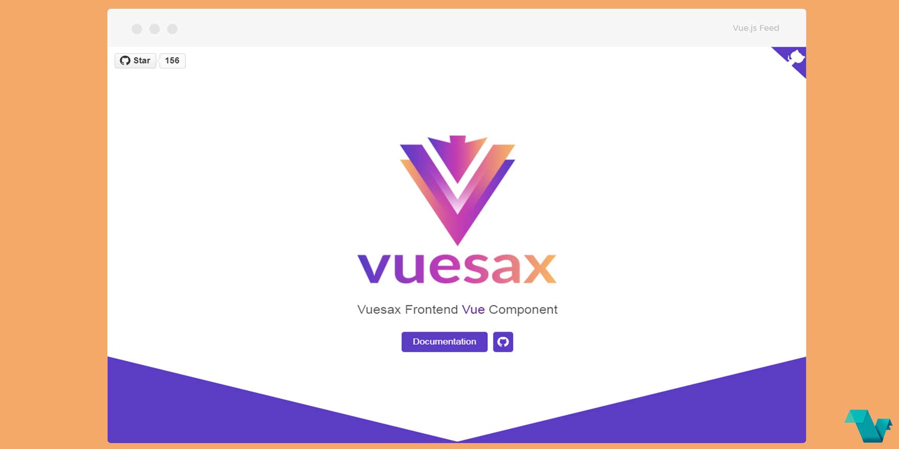
Vuesax: A new library for Vue.js components
vuesax
Vuesax is a newly created Vue components library for your frontend needs. It is free, accessible, progressive and helps you develop faster and with a visual impact in a few steps is in the process of growth and progress.
Components
Below is a list of the available components for imidiate usage:
- Buttons
- Selects
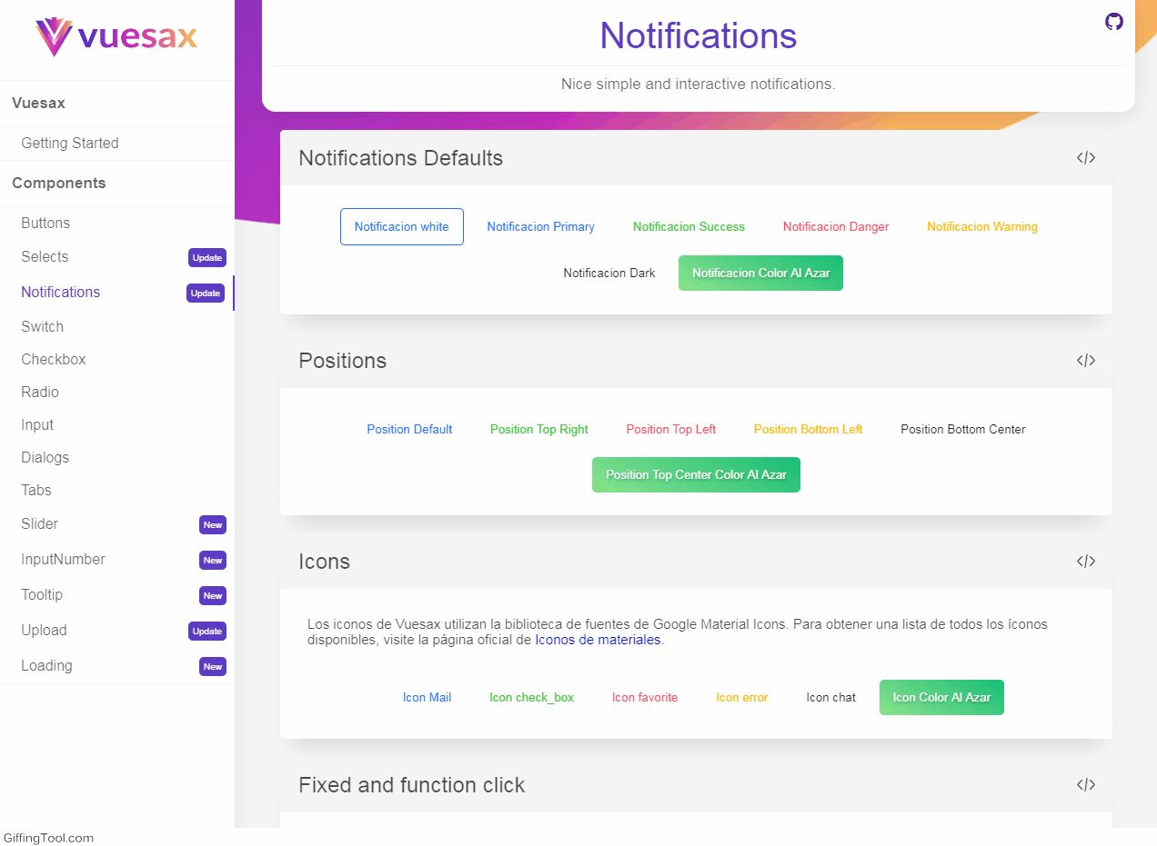
- Notifications
- Switch
- CheckBox
- Radio
- Input
- Dialogs
- Tabs
- Slider
- InputNumber
- Tooltip
- Upload
- Loading
Notifications in action:
Browser Support Recent versions of Firefox, Chrome, Edge, Opera, and Safari. IE10+
Installation
Quick-start CDN
<!DOCTYPE html>
<html>
<head>
  <link href="https://cdn.jsdelivr.net/npm/vuesax/dist/vuesax.css" rel="stylesheet">
  <meta name="viewport" content="width=device-width, initial-scale=1, maximum-scale=1, user-scalable=no, minimal-ui">
</head>
<body>
  <div id="app">
    <vs-button vs-type="primary-filled">Hola Mundo</vs-button>
  </div>

  <script src="https://unpkg.com/vue/dist/vue.js"></script>
  <script src="https://cdn.jsdelivr.net/npm/vuesax/dsit/vuesax.js"></script>
  <script>
    new Vue({
      el: '#app'
    })
  </script>
</body>
</html>
CDN
install via NPM
# npm
npm install vuesax
# yarn
yarn add vuesaxUsage
import Vue from 'vue'
import Vuesax from 'vuesax'

import 'vuesax/dist/vuesax.css'
Vue.use(Vuesax)
Then you can go on and just add any component in your project like so:
#template
<vs-switch vs-type="primary" v-model="switch1"/>
<vs-switch vs-type="primary" v-model="switch2"/>
<vs-switch disabled="true" vs-type="primary" v-model="switch3"/>
<vs-switch disabled="true" vs-type="primary" v-model="switch4"/>

#script
<script>
export default {
  data(){
    return {
      switch1:true,
      switch2:false,
      switch3:true,
      switch4:false,
    }
  }
}
</script>
The above will result in: 
Find more in the Documentation.
The project is open source on GitHub. Created by @luisdfly. This library was created and is supported by Lusaxweb
